Why are we still primarily sharing findings in science and medicine the same way we did 20 years ago?
The internet revolution of the ‘90s was followed quickly by the digitization of many tasks easily improved by being electronic – for example, when was the last time you wrote a check to pay a bill by mail?
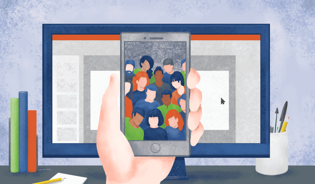
The same should be happening for conference presentations which, for the most part, haven’t joined the digital revolution.
Of course, this conversation is partly precipitated by a pandemic-driven need for social distancing, but the tips and suggestions that follow apply regardless. It’s important now, more than ever, to share findings widely. And it’s still possible, maybe even easier.
Suggestion 1: Animate your presentation to easily share online
Virtual conferences have rapidly supplanted traditional meetings in the social distancing era. While these are a temporary and necessary fix for current times, there’s no reason we can’t continue to benefit from the positive aspects of virtual conferences down the road.
Virtual conferences call for virtual presentations and both oral presentations and posters can easily and effectively be converted to short videos. Animated GIFs and auto-play slideshow presentations are easier than ever to make, including adding an audio track so you can walk folks through your presentation.
When planning out your virtual presentation keep these two best practices in mind:
1. Keep it short: Studies have shown that the most effective and engaging internet videos are less than two minutes. Even for the most complex topics, your presentation should not exceed five minutes. If you think you need more time, consider breaking down your story into two shorter presentations. Only create a longer presentation if the venue specifically calls for it (i.e. a 10-minute oral presentation). The reality is: no matter how interesting you find a topic or how well you present it, people on the internet rarely show the attention span for anything longer.
2. Graphics heavy, text light: The more you can say with pictures the better. Fewer words on the screen means the viewer pays more attention to what you’re saying and showing. Methods can often be made into pictures and data is often best presented as graphs. Think of how much easier graphical abstracts are to digest than written abstracts. Coming up with ways to present your topic with images rather than text is one step on the path to becoming a better science communicator.
Now it’s time to make the magic happen. First, you’ll have to parse your presentation into digestible nuggets of science-y goodness. This is easier than it sounds because your data is likely already in a slideshow from a recent lab meeting presentation. But because you only have limited time and few slides, you’ll need to be sure to pull out only the most important details. Think of these as the who, what, why and how (more on those in a sec).
We’re aiming for no more than eight slides in total. With eight slides you have about 15 seconds per slide to fit the two-minute guideline mentioned earlier. You won’t need that much time for all slides (e.g. the title slide) so you have wiggle room to spend slightly more time on other slides. You can also use fewer slides and have more time for each. Here’s how I’d suggest framing your presentation:
1. Title slide and authors – This takes care of the who and can be short in duration
2. Important takeaways – Start with a broad summary of the big conclusions from the presentation – the what. This might seem paradoxical: beginning at the end, but in fact serves to draw in the viewer’s attention for the rest of the presentation. Hooking them on slide two will keep them around for slide eight.
3. Background – Now you can back up and give context on what led to this study, the why. Try to keep this simple and direct the flow of information from big picture factors that narrow down to specific background details. Your best bet is to use no more than 3-4 background points.
4. Methods – Try your best to highlight important methods on a single slide, the how.
5-7. Up to three findings slides – Remember to show your data (graphics) rather than say your data (text) as much as possible. If you use fewer than three slides for data, you can spend more time on other slides.
8. Important takeaways – Repeat your conclusions/takeaways here to reinforce the main points. People learn by repetition. People learn by repetition. Bookending your slideshow with important takeaways means that these are the points most likely to be remembered later. And that’s exactly what you want from details that are important, right?
Once your slide show has been put together there are two ways to create an animated and easily shared slideshow.
The first option is to create an auto-playing slideshow. In PowerPoint this is done using the ‘record slide show’ function found in the ‘Slide Show’ menu. When recording you have complete control over how long each slide is displayed in addition to the option to add narration. You can either record the whole show in one playthrough, or record slide by slide. While recording you can also draw attention to slide elements with the pen, eraser or highlight tool. Everything you record, from slide timing, to audio track, to on-slide highlighting can be edited later, so don’t fret if you make a mistake.
Here’s a quick video tutorial to help.
The second easy option is to convert the slides into a GIF. In PowerPoint/Keynote that’s as easy as using the ‘Export’ function: GIF is an export option and you can select the time spent on each slide in the GIF. Voila!
Option 2: Pre-record walkthroughs of your poster presentation
Anyone who’s stood in front of a poster presentation for a few hours is prepared for the inevitable ‘can you please walk me through your poster’ question. No matter how much time was spent preparing the poster to be as self-explanatory as possible, this always happens. As much as you enjoy talking about your hard work, it can get a little repetitive. It’s also more gratifying answering specific questions about your research and its implications than giving the broad overview. Instead you spend time repeating almost the same scripted walkthrough over and over.
How much more efficient would it be to just have the walkthrough pre-recorded and available for anyone that needs it? This is also easy to do using the steps detailed below.
1. Prepare and practice your script before recording: Even if you’re confident that you know your material inside and out, it always helps to work from a script. This will keep you focused on the important details and will help ensure you don’t forget anything. Practice reading through your script a few times to ensure it flows naturally.
2. Record your audio presentation: Most computers come preloaded with software that can record audio but there are also a number of free media platforms, my favorite being VLC. All are equipped to use built-in computer microphones to record so you don’t even need a stand-alone mic. When done recording you’ll end up with an audio file (typically in .mp4 format) that can be played on smartphones or computers.
3. Share the audio file on your poster using a QR code: Permanently linking your recorded poster presentation to the poster is easy with a QR code. Most modern smartphones have QR code readers built into the camera apps making QR codes easier than ever to access. All you need to do is upload your audio file to a preferred cloud storage platform and link the audio file to a QR code. Here’s a short tutorial on how to do this using Google Drive and a freely-available QR Code generator: https://www.youtube.com/watch?v=t3amoYNpMjg
You can place the QR code image right on your poster. Now anyone who checks out your poster has the option of scanning the QR code with their smart phone and listening to your full poster walkthrough at their own leisure, freeing you up to answer more specific questions about the presentation content. This is a real game changer.
Not only will you save time during the presentation itself, but anyone who misses your poster can now access it at a later date. After you’ve uploaded the poster on your lab’s website, shared it on social media or potentially archived it with the virtual conference organizers, the QR code-linked audio file will still be available. This gives life to science posters well beyond their original presentation venue and makes your hard work that much more accessible.
Conclusion:
Bringing scientific presentations to the digital age should have happened long ago. All it took was a global pandemic to get people interested in the concept. But now that we’ve come to this point, there’s no reason to go back.
Even when the social distancing era is over and there are fewer virtual conferences (these definitely aren’t going away), the tips I’ve given to help widely share your presentations will be just as useful.
Imagine never having to give that full poster walkthrough again. Think of how jealous your friends will be with your flashy animated slideshows. Now go forth and share your knowledge widely.
Graphic created by: Autumn Von Plinsky